The fish of Port Grimaud :
As soon as the work began, François SPOERRY wanted to associate his budding city with a symbol, a logo... It was a fish !
Several drafts :
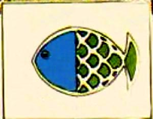
After several drafts, here is the first logo that was to be associated with the lake city, as it appeared at the very beginning.
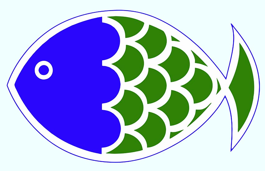
Then, with time, the poison with 2 colours, blue for the head, green for the body, improved...
.
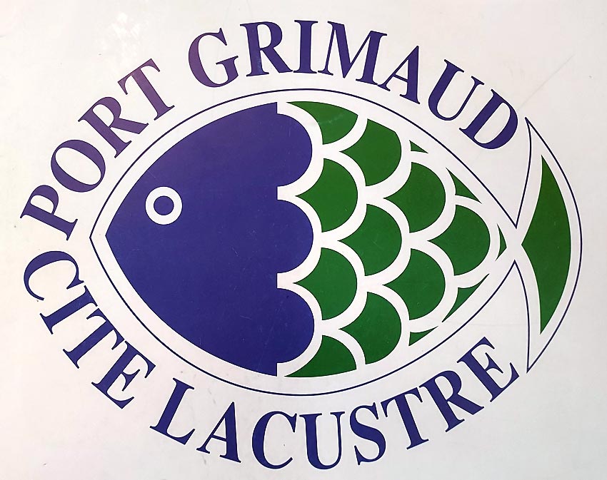
The
Blue represents the
sea and the
green the
earth, the
nature.
Port Grimaud is both
sea and
land, a lake city.
autre logo...
Trademark :
François SPOERRY protected it as a 'registered trademark', as well as the name 'Port Grimaud'.
This stylised fish will be reproduced on all administrative paper, on the flags flying at the entrance to the port, on the town hall and on the architect's house when he was staying in PORT GRIMAUD, or on the many boats moored in the lake town.
It quickly found its way onto various objects and souvenirs, from T-shirts to postcards, from key rings to ashtrays...
Colour reversal :
At the end of the 90's, a former President of the PG1 ASP, reversed the colours, the head became green on a blue body, in order to 'register' this new logo at the Inpi on 31 August 1998... This mark has expired as valid for 10 years and has not been renewed.
This singularity, specific to PG1, has lasted until today...
On
September 3, 2022 the President of the
ASSOCIATION SYNDICALE DES PROPRIETAIRES DE LA CITE LACUSTRE PORT GRIMAUD, Mr. DORGNON filed a new logo and it is a great joy because this logo, faithful to the original, will perhaps FINALLY replace the green headed fish. Un seul logo pour notre village lacustre, comme du temps de Monsieur SPOERRY !
Why change the logo? :
In a company, change is very badly perceived by the clientele: (The "Gap" brand had to revert to its previous logo a few years ago less than a week after launching the new one).
A change should be very limited by the addition of a detail that characterises a function (Very nice logo of the Marina for example with its anchor to indicate that it rents moorings)
Changing for the sake of changing, for the sake of fashion, or simply to distinguish oneself from the other entities of Port Grimaud is not compatible with the soul of our lakeside town...
A single logo for a single PORT GRIMAUD !!!
PG3's MARINA logo :
Very nice logo of the former
Marina of Port Grimaud III which had taken over the fish of the lake city
On their
website it was even more beautiful, more current and with a nice reflection in the water...
The Yacht Club logo :
The logo of
Yacht Club respects the authentic colours of the fish.
Lhe boundary between the
blue and the
greent varies between logos. The separation here is straight.
The same rectilinear separation can be found on the website of Mr. SPOERRY's architectural firm.
In the 1990s, companies discovered the usefulness of a website but did not necessarily understand the layout: the logo of the Architecture firm's website (opposite) suffered from a lack of clarity...
Port Grimaud 3 :
On the official PG3 papers, the separation is straight.
On sales brochures, blue and green are separated by a straight white border...